A Brand That Honors The Brilliance of Our Students
By Monique Zurita
August 12, 2019
Earlier this year, OneGoal’s Marketing + Communications team embarked on a creative journey to give our brand a little TLC. Here, our Managing Director of Marketing + Communications Monique Zurita, shares a bit more about the “why” behind our rebranding.
Last August, more than 100 OneGoal employees came together to dig into our new foundations, including our new vision, mission, core values, and commitment to diversity, equity and inclusion — the critical elements that shape what we do and how we do it. Our Fellows, Program Directors, allies and entire staff informed these changes, and it was energizing to start envisioning how they impacted us personally and would shape our organization.
Our former Chief Program Officer (now CEO) Melissa Connelly led an incredible session introducing a plan to transform our program so that it truly works for all Fellows and matches the depth and complexity of the college degree divide.
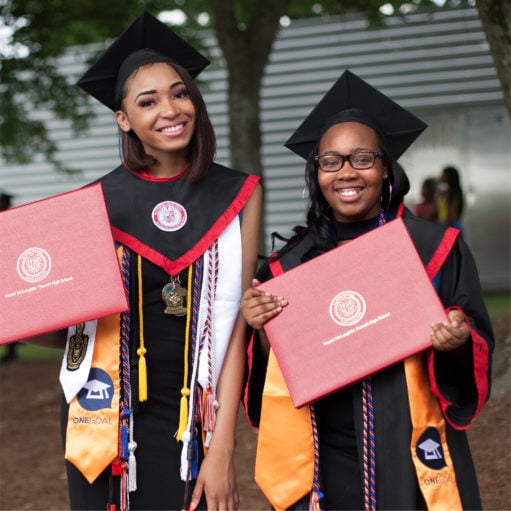
An important part of the change in our program strategy was recognizing that our Fellows choose different paths after high school: many go to four-year colleges and universities, while some choose two-year degrees and still others choose trade schools and certificate programs. There are also those who continue their education through grad school.
Melissa declared OneGoal’s role is to affirm our Fellows, help them discover and pursue their greatest postsecondary aspirations and support them through their journey as they encounter and overcome challenges.
I’ll always remember one staff member raising her hand asking how all this was going to impact our brand and how we communicate this shift externally. As the head of marketing, all eyes turned expectantly to me.
I don’t remember my exact answer, but I do know that right after the event, our team began to ask ourselves, what would it look like if our brand truly reflected the brilliance of our students and the boldness of our program? Our new brand is our answer to this question. It honors the diverse paths our Fellows take, has a bold and optimistic look, and emphasizes collaboration because we know that together, we go further.
Now that you know more about the “why,” below is more information into how the process came about:
Who:
While the project was led by our Marketing + Communications team in partnership with Sunday Morning, a New York-based boutique creative agency, we leveraged insights from staff, Fellows and Program Directors. Our senior leadership team also provided input and eventually approved the new brand.
How:
First, we grounded ourselves in OneGoal’s new foundations, and reviewed all the insights that were used to build them. We then visited Fellows in class and spoke informally with staff members. We looked at peer organizations and other companies that we admired, interviewed staff members and then together identified the components we needed to add or evolve for our refreshed brand.
From there, we explored several creative options, settled on one, and began developing our brand belief, brand promise, tagline, logo and other design components. We brought in Fellows and staff members at various stages. Once the tagline and design components were approved, we introduced the new brand to our national board in early May.
What:
Okay, we know this is the part you’ve been waiting for — what’s changed. Early on we recognized that we wanted a brand refresh, not a rebrand. Or said another way, we wanted an evolution, not a revolution.
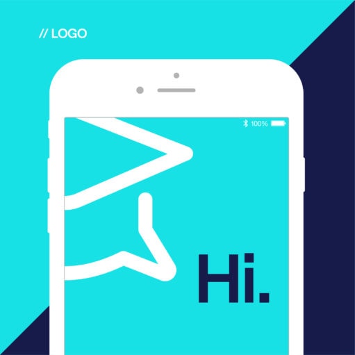
There was a lot we loved about the old brand and we wanted to build on that. To start, we simplified our logo. We maintained the iconic grad cap, but combined it with a thought bubble meant to capture the importance of student voice. Our tagline evolved to “Graduation. Period,” which succinctly captures our mission, but is more inclusive of other postsecondary pathways.
You’ll also see that our color palette has been updated from orange and navy blue to tangerine and indigo, with some new colors bringing more energy and zeal. Our font has a fresh feel and we’ve also incorporated new design elements, such as lines and icons, to help our brand stand out from the crowd. The curved, often converging lines represent the many paths our Fellows take, which are rarely straight, and emphasize the power of collaboration.
As you can see, there’s been quite a few changes, but our mission and commitment to our students has remained the same. We certainly can’t do this work alone and we hope you’ll join us on this next part of our journey to close the college degree divide.